Vizer
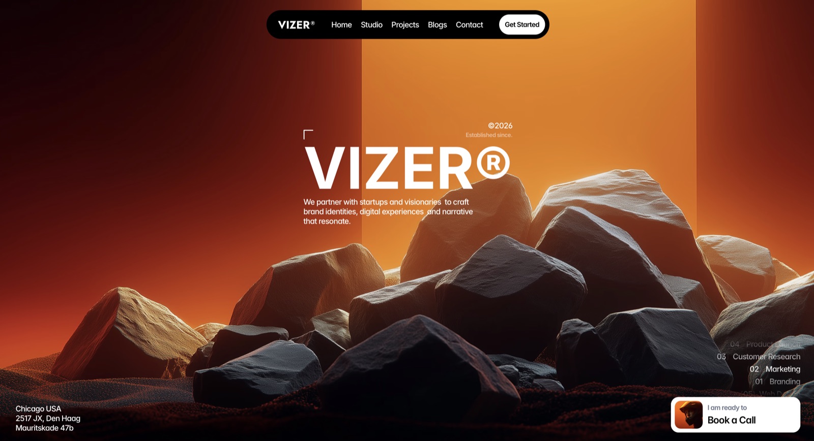
An agency identity built on contrast. Intense orange against deep black, presence over decoration, conversion logic underneath the look.
A design-language exploration. Showing what we are able to build for this kind of brand, not delivered client work.
Client
Vizer
Year
2026
Category
Design Solutions
An agency identity built on contrast. Intense orange against deep black, presence over decoration, conversion logic underneath the look.
The Challenge
A design studio's own site has to demonstrate point of view immediately. Generic agency layouts undermine the work itself.
Our Solution
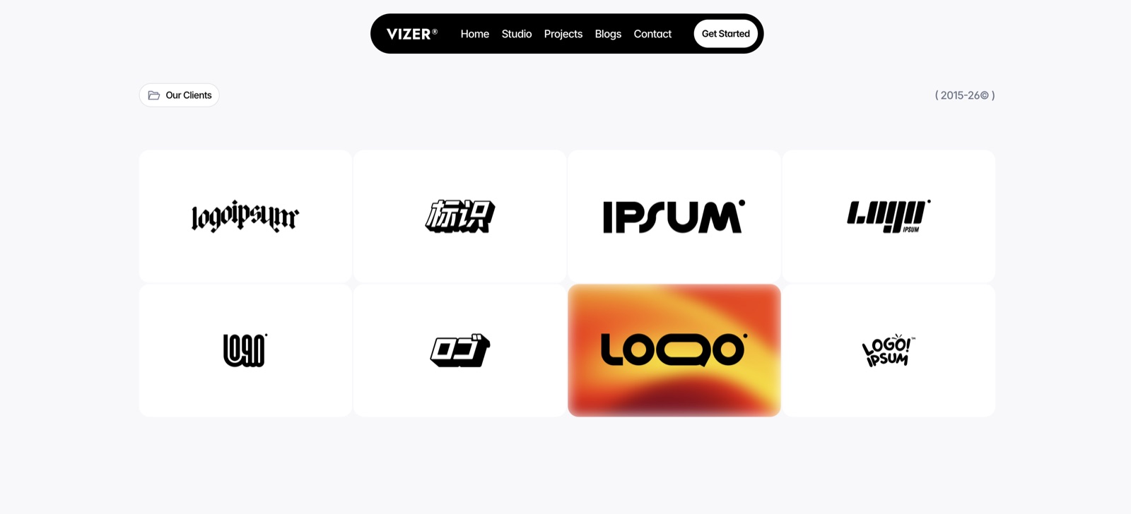
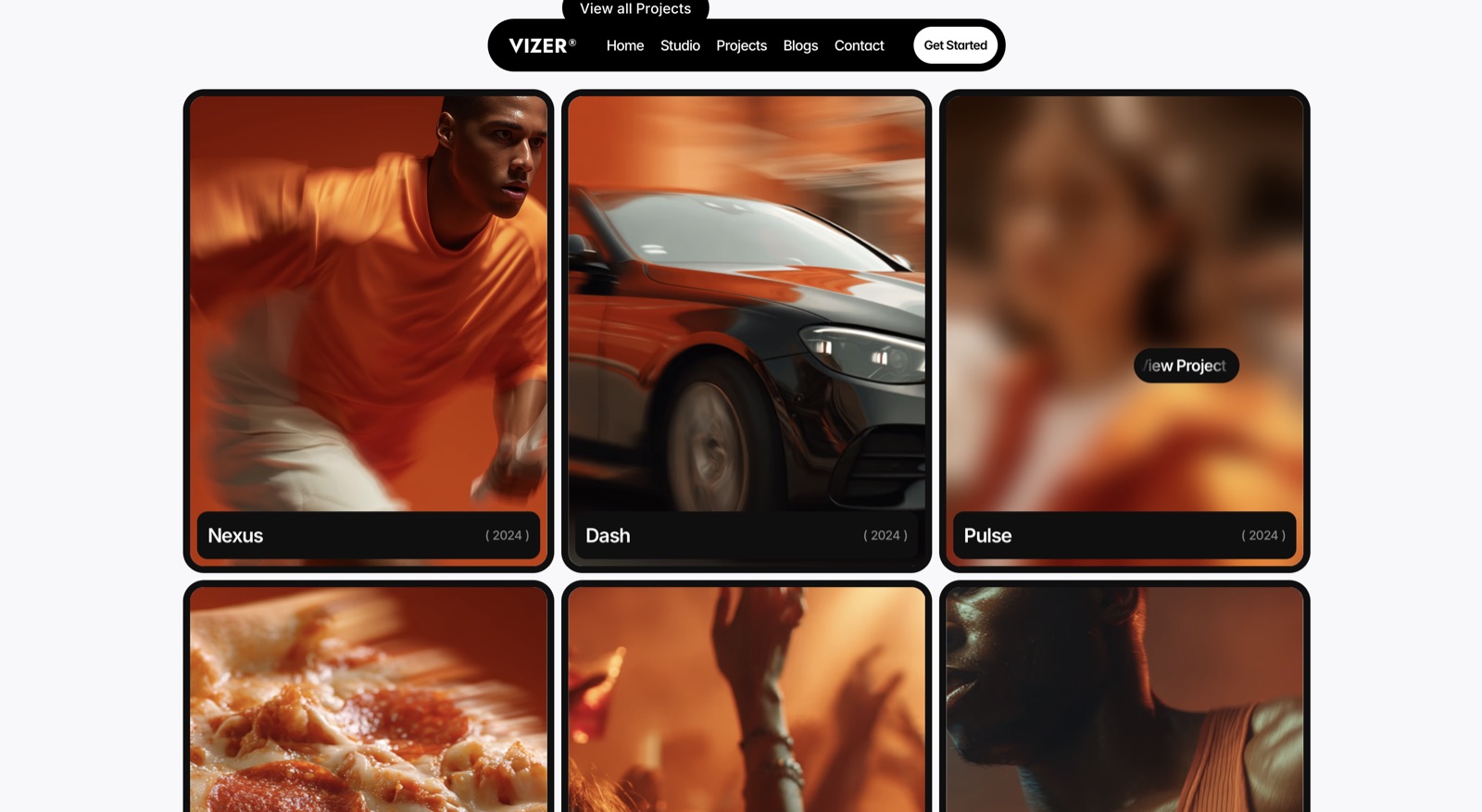
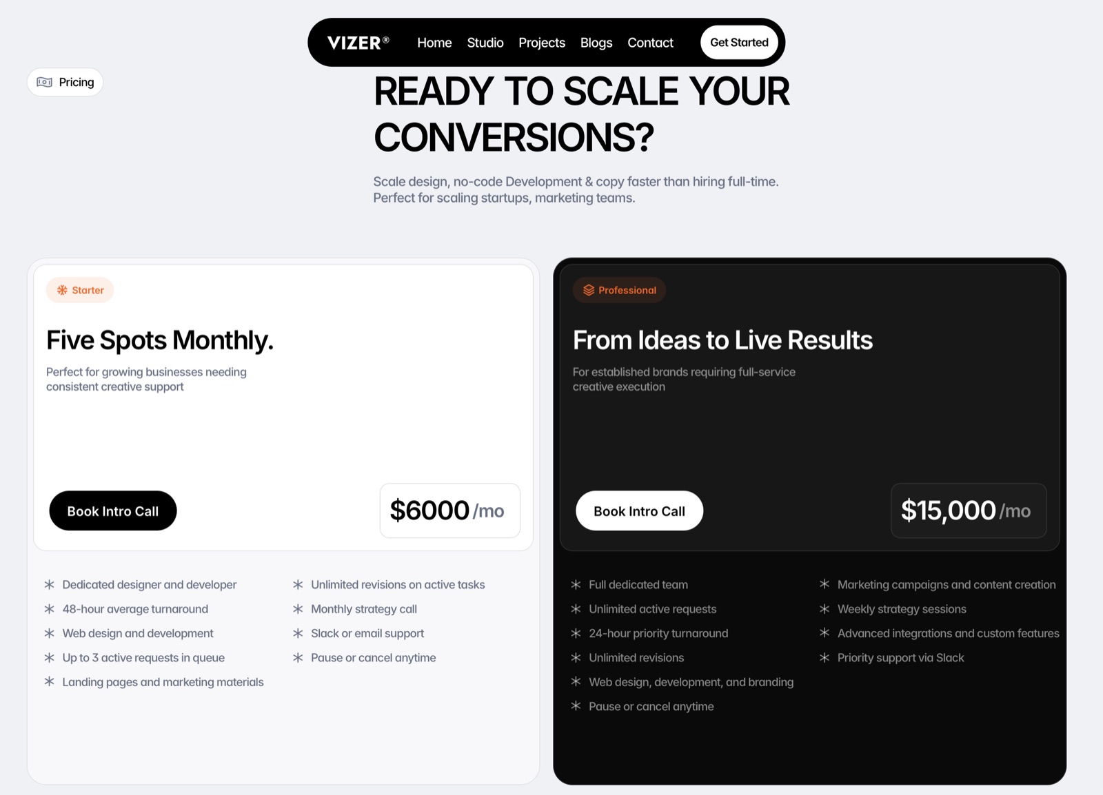
A bold hero sets a tone of impact rather than just aesthetic. The client grid simplifies credibility without overwhelming. The projects section uses motion and blur to encourage exploration. Pricing is structured for clarity over complexity.
The Result
The site balances creativity with function. It looks premium and communicates trust, clarity, and direction at the same time.