Clario
A high-contrast SaaS interface where the product becomes the proof. Dark canvas, neon accent, dashboard-first storytelling.
A design-language exploration. Showing what we are able to build for this kind of brand, not delivered client work.
Client
Clario
Year
2025
Category
Digital Systems
A high-contrast SaaS interface where the product becomes the proof. Dark canvas, neon accent, dashboard-first storytelling.
The Challenge
A SaaS product is hard to communicate in abstract terms. Feature lists feel generic; what users need is to feel what the product is like.
Our Solution
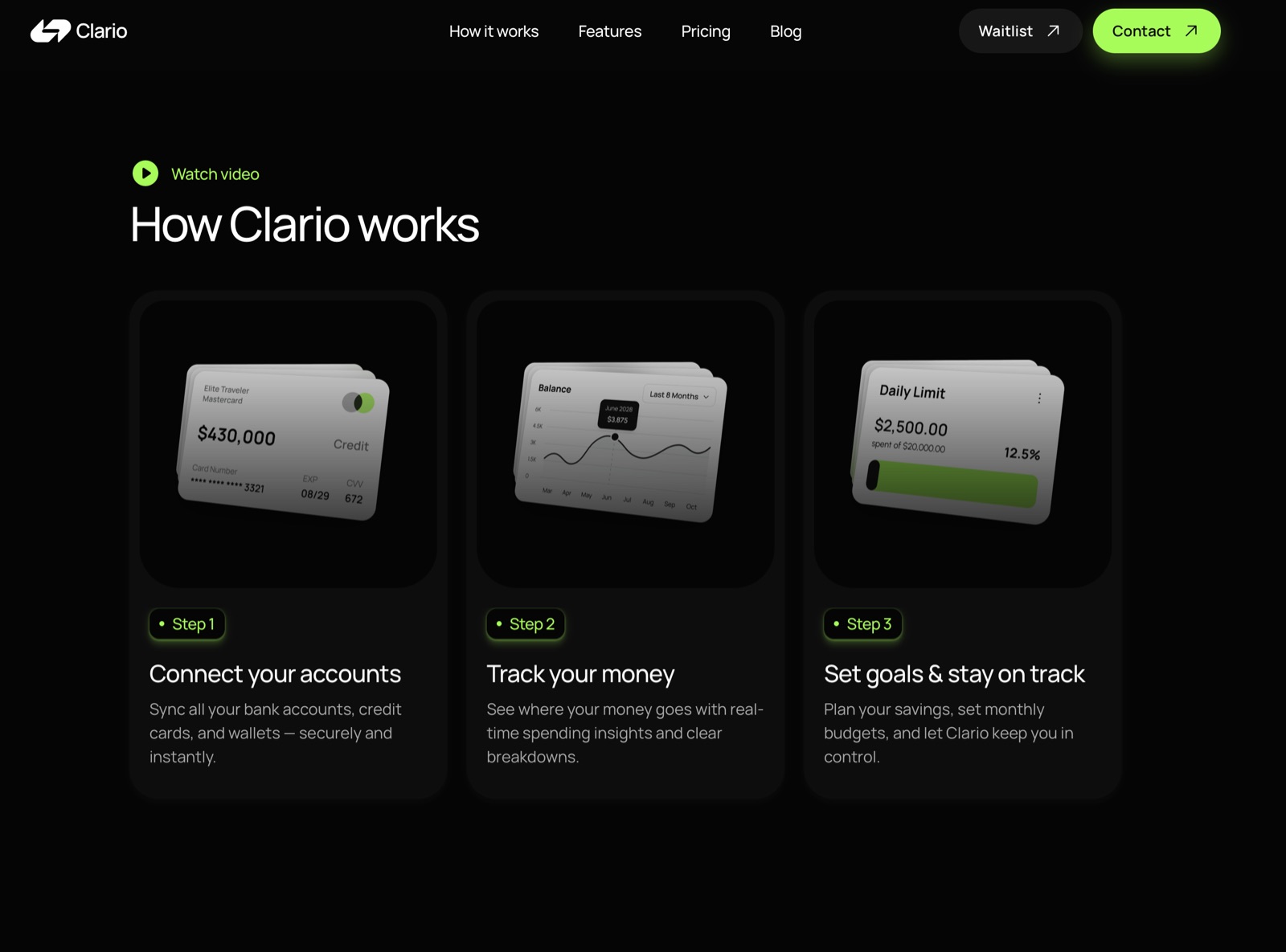
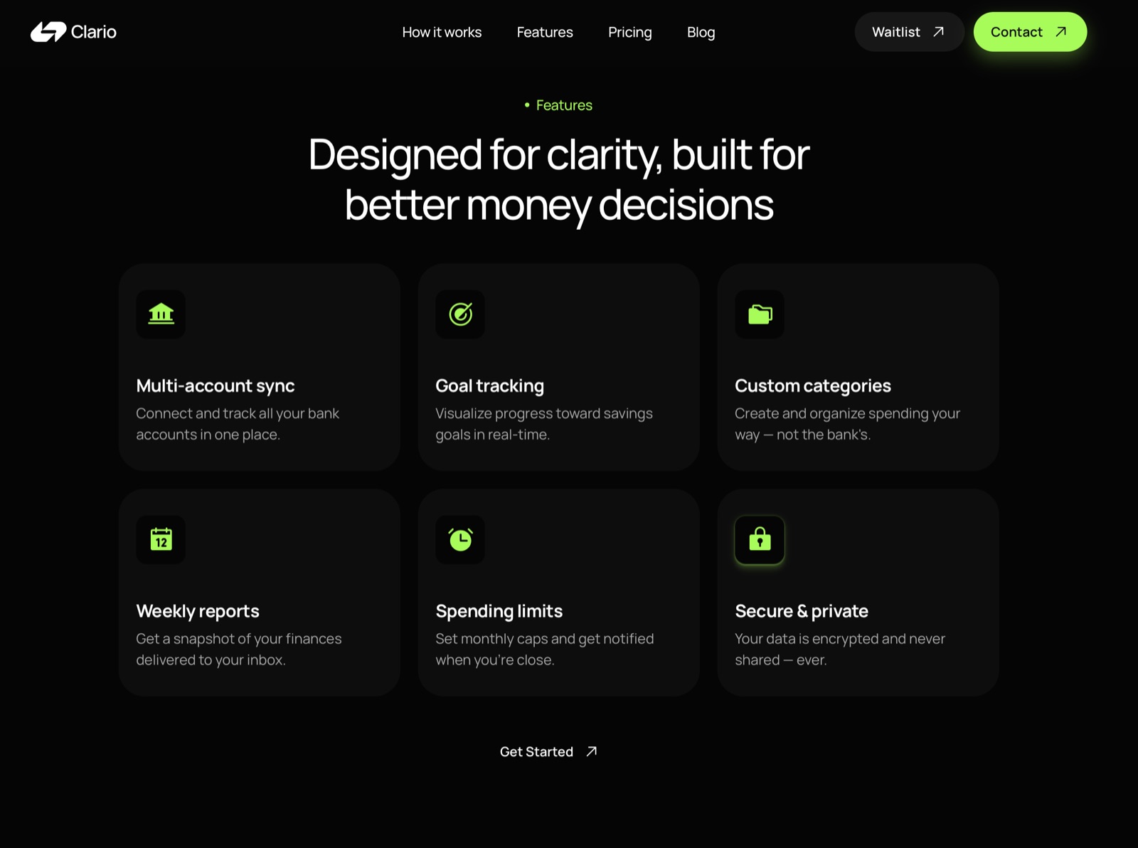
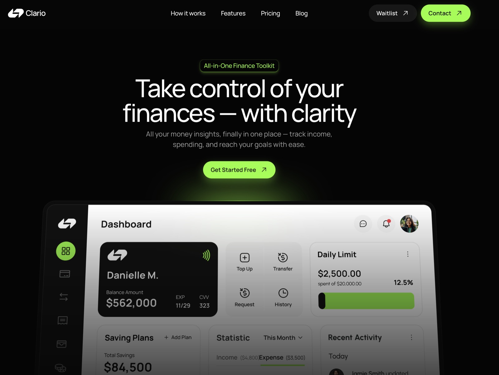
A bold dark hero with neon accents defines the brand instantly. The dashboard preview replaces feature explanation — the interface itself is the demonstration. A "How it works" section breaks the experience into achievable steps.
The Result
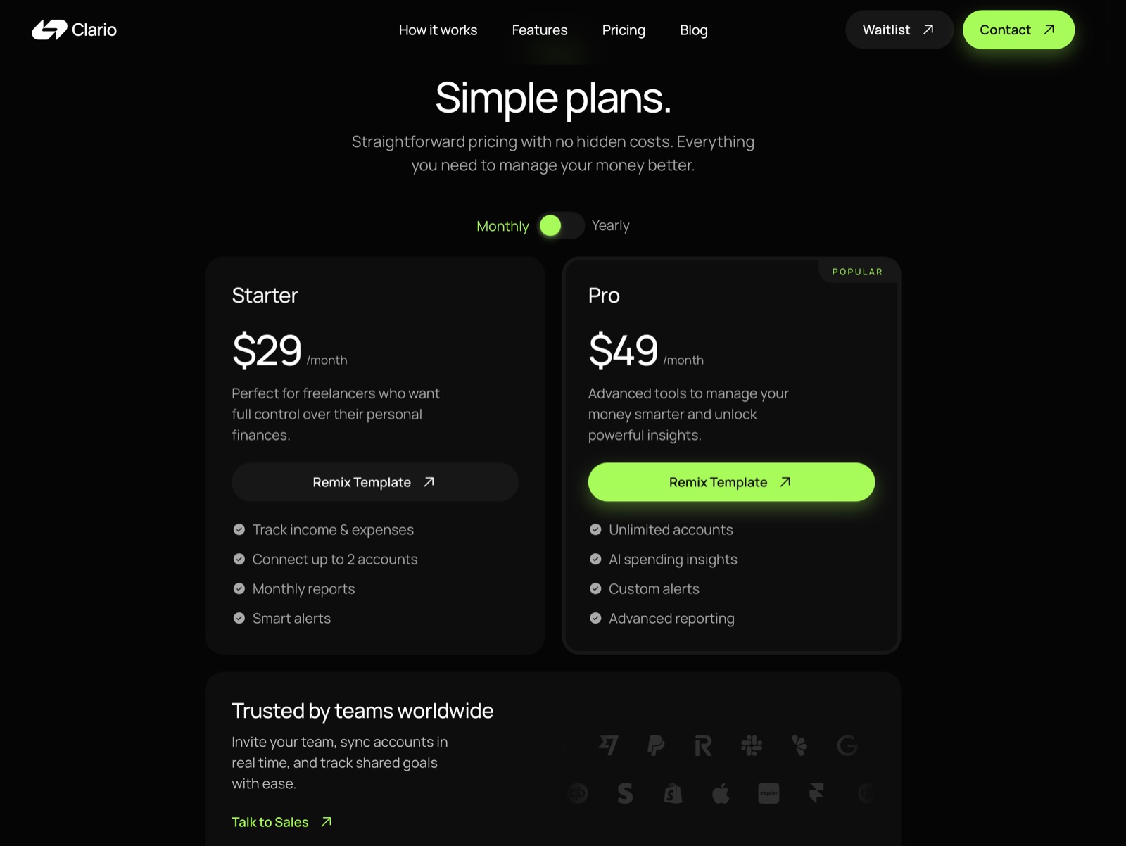
Cognitive load drops because every section uses the same structure and rhythm. Pricing is presented side by side with clear differentiation, simplifying the decision.